Verve AI
Oct. 2024 - Jan. 2025
Team
Directly work with CEO
Deliverables
Product Design
Interface Design
Dashboard Design
Design System
Method
User Behavior Analysis
Market Research
Competitor Analysis
User flow
Hi-hi prototype
Verve AI is a real-time AI interview copilot that provides live assistance, mock interview practice, and resume optimization for job seekers.
In a small-early stage startup, I worked closely with the CEO (developer), and proactively drove the entire design progress. He briefed me on the project and gave me design feedback throughout the process.
Promblem
The platform's current design suffers from a critical flaw: it offers limited information and insufficient guidance for first-time users. This directly contributes to high sign-in drop-off and low user return rates. Moreover, the platform is largely perceived as a one-time utility, with most users completing a single session and then disengaging. This "use-it-and-forget-it" behavior has led to poor user retention and a significant lack of sustained engagement.
This project reimagines the platform as a long-term career companion rather than a one-time interview tool. By introducing a personalized onboarding experience and a dynamic, all-in-one dashboard, the redesign encourages continuous user engagement—whether for upcoming interviews or ongoing skill development.
Research
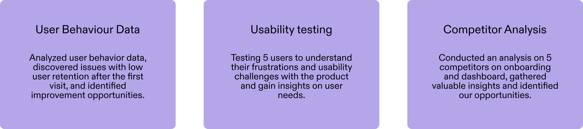
This research helped me identify user pain points and uncover their root causes, enabling me to develop targeted strategies to improve the product. Drawing on these insights, I began designing with a
focus on creating a more engaging first-time user experience and encouraging repeat visits.
Chanllenge 1
After signing in and creating a persona, many users fail to proceed
to start a session.
The testing also indicates that
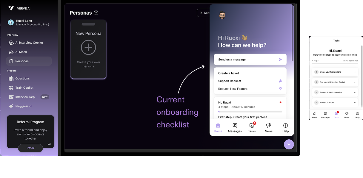
current onboarding checklist is not effective.
Users tend to skip it due to it’s optional, which results in a lack of proper guidance after sign-in and leaves users feeling lost.

Usability testing revealed that many users didn’t know what to do next, which led them to give up early.
Competitive anaylysis
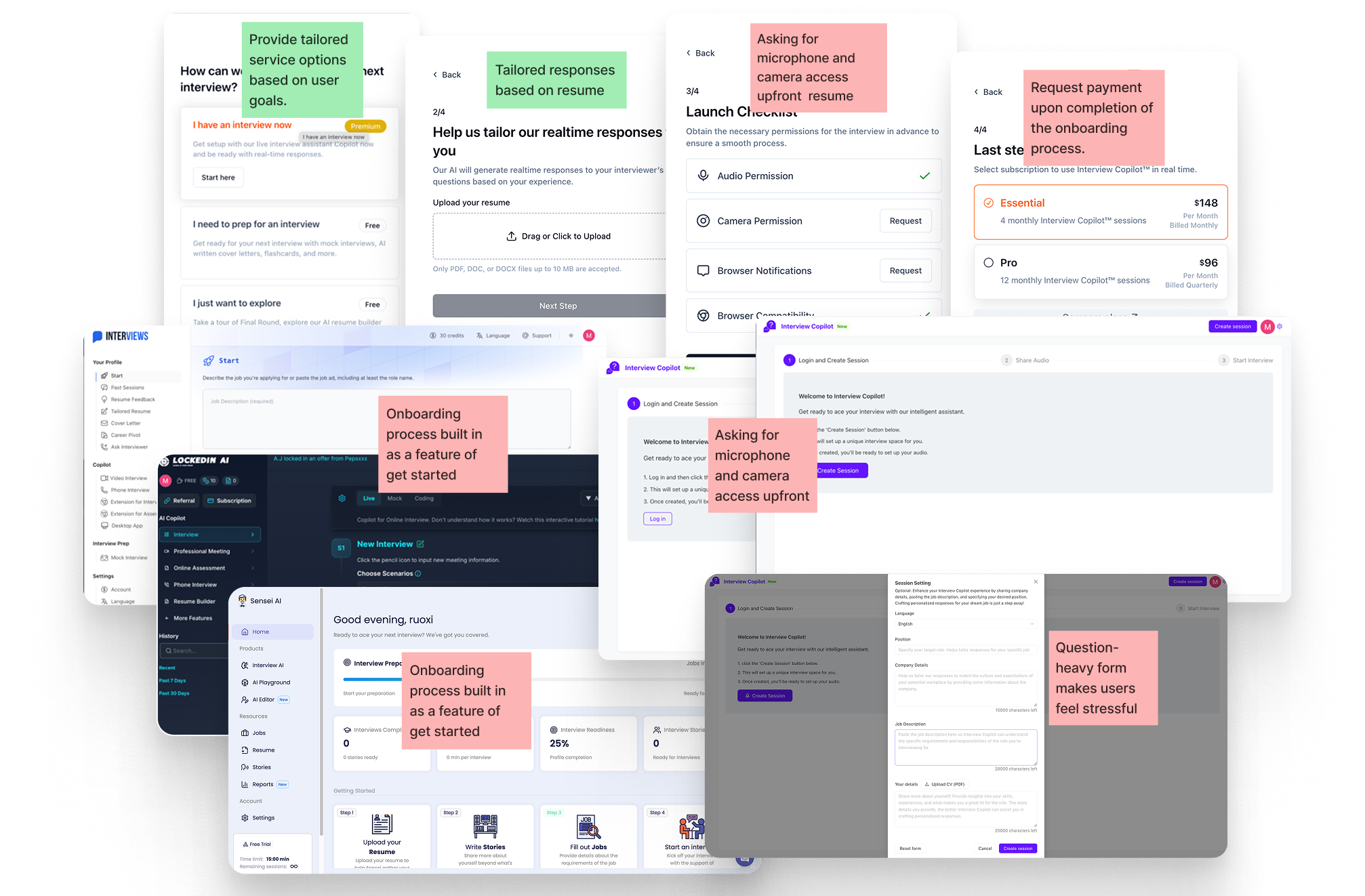
- Asking too many required questions during onboarding can create friction and lead to user drop-off.
- Requiring payment right after onboarding might feel too sudden and push users away.
- Asking for microphone and camera access upfront can make users feel uneasy, instead we should focus on building trust first.
Design Process
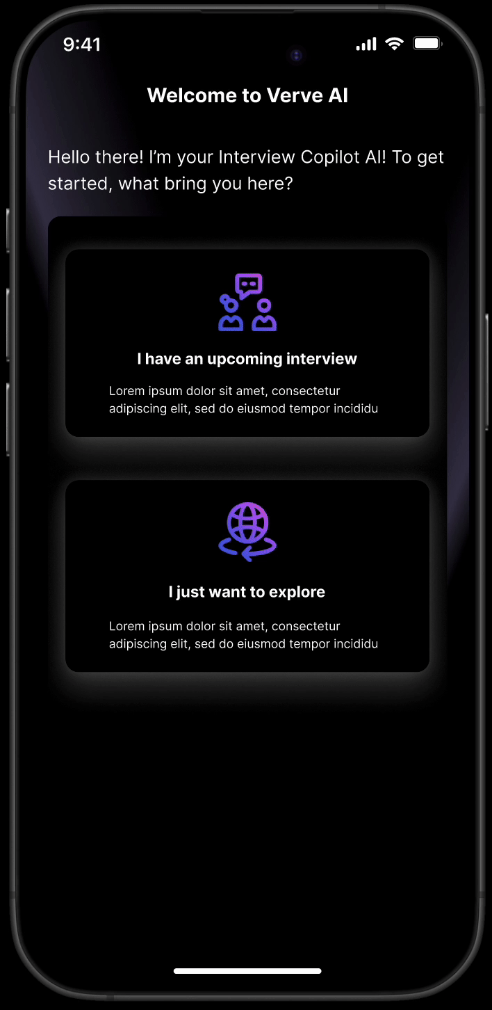
Help users understand the product’s value and guide them through key actions by implementing an onboarding process,
reducing confusion, and building their confidence in using the product.
reducing confusion, and building their confidence in using the product.
Onboarding Design Princple
1. Highlights our capabilities to build trust and demonstrate the value of the product.
2. Carefully controls the number and relevance of questions to simplify the onboarding process and minimize the time required.
2. Carefully controls the number and relevance of questions to simplify the onboarding process and minimize the time required.
Brainstorm
![]()

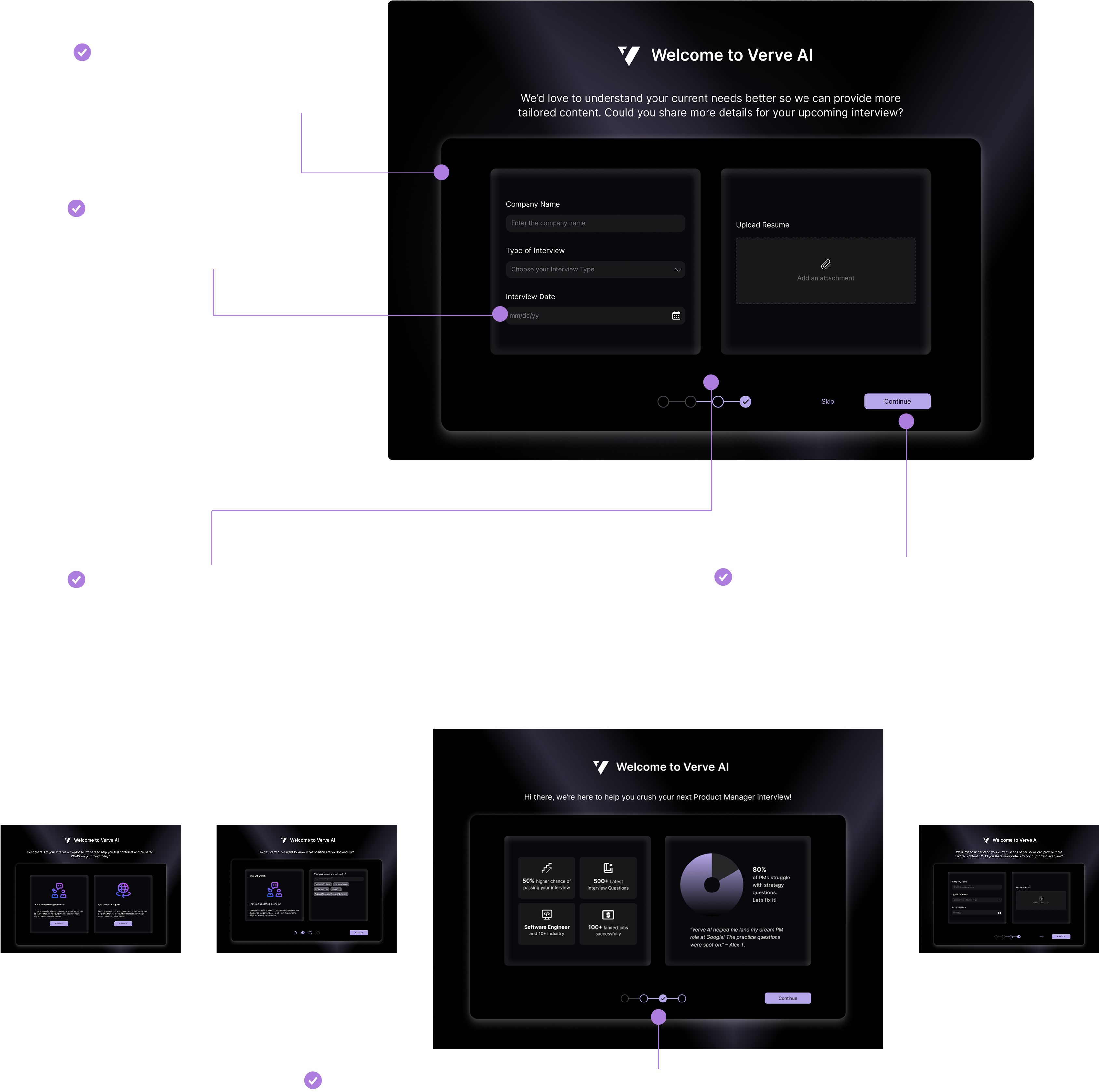
Version one

- Two-column layout to highlight product value: The left side introduces our product to showcase its value, while the right side collects user information in a structured way.
- Dynamic, personalized onboarding: Users are guided through different next steps based on their intent, with tailored questions to keep the experience relevant.
Design Iteration
I organized a design review session with the CEO to gather early feedback, align on expectations, and ensure the design was heading in the right direction. After the first round of review, I received valuable input and iterated on the design to deliver Version 2.0.
The information didn’t feel very focused—it was a bit all over the place and hard to follow.
The form felt too heavy with all the questions crammed on one page, making it overwhelming for users.
The iterated design focuses on presenting information more effectively , make user focus on the key action, and less heavy , reduce user cognitive load
Chanllenge 2
User return rate is low, user drop after one interview session, most of
users use the platform as a one time use.
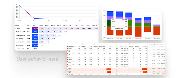
User behavior data showed a low return rate after the first visit—
only 4% returned in the first week
2% in the second week
—significantly below the benchmark for healthy user engagement.
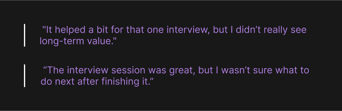
User interviews revealed in further that the first page failed to convey enough value or motivate further exploration, suggesting the current design lacks user engagement and clarity.
I further refined the problem, although we’ve built valuable features like learnings, meeting report, users often miss them because they’re buried in secondary pages. As a result, they lack the motivation to explore or engage with these tools.
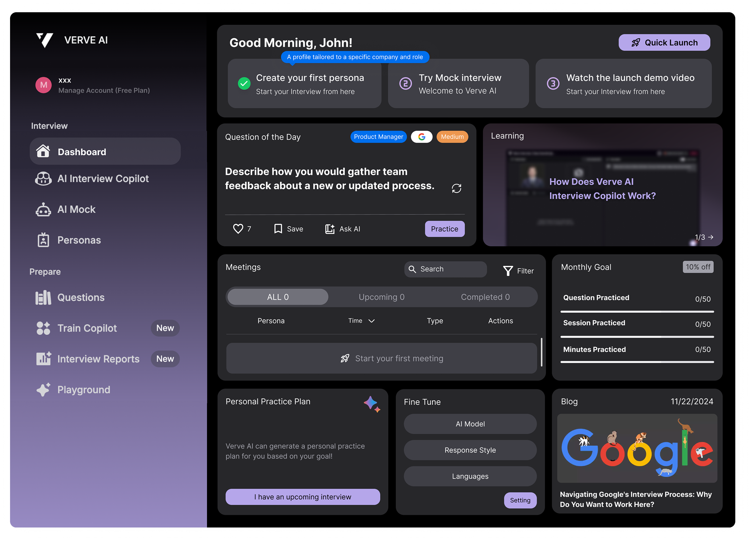
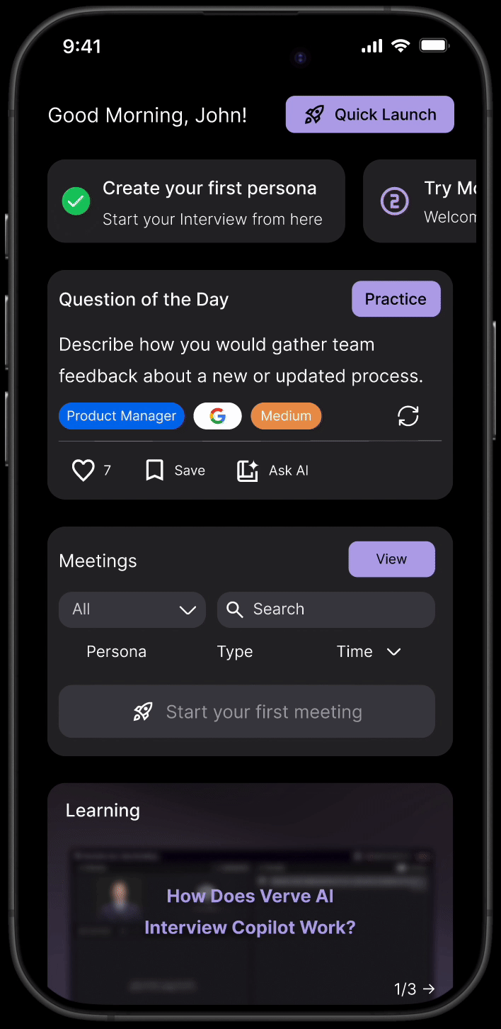
To address this, I decided to implement a dashboard that surfaces these key features and makes their value more immediately visible to users.
Competitive anaylysis

- Features are mostly tool-based requiring users to know what they need.
-
Competitors don’t provide analytics or visibility into user progress
- Competitor doesn’t have personalized features, experiences are static and one-size-fits-all.
Design Opportunity
- Support users with clearer guidance and encourage exploration with a dashboard.
- Making previously hidden features easily discoverable through a centralized access point.
- Create personalized content to increase user to engage and use the platform more often
- Evolve the platform into an all-in-one solution for job seeking and real-time co-piloting.
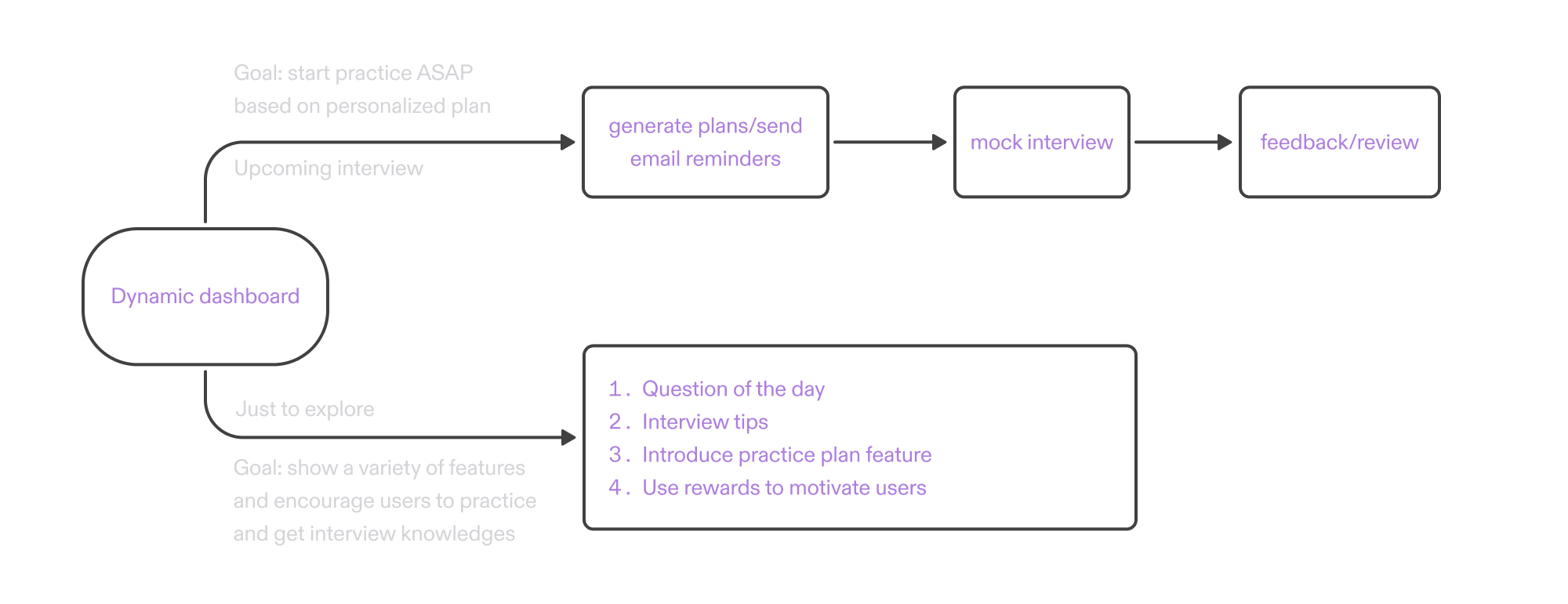
Before diving into detailed design, I revisited and restructured the user flow to better align with diverse user needs—ensuring a smoother, goal-oriented experience where onboarding dynamically tailors the dashboard to highlight relevant features for different user types.
Design Process

1. Personalized Experience
The dashboard reflects and extends the onboarding process. Users feel the experience is tailored to their needs from the very beginning.
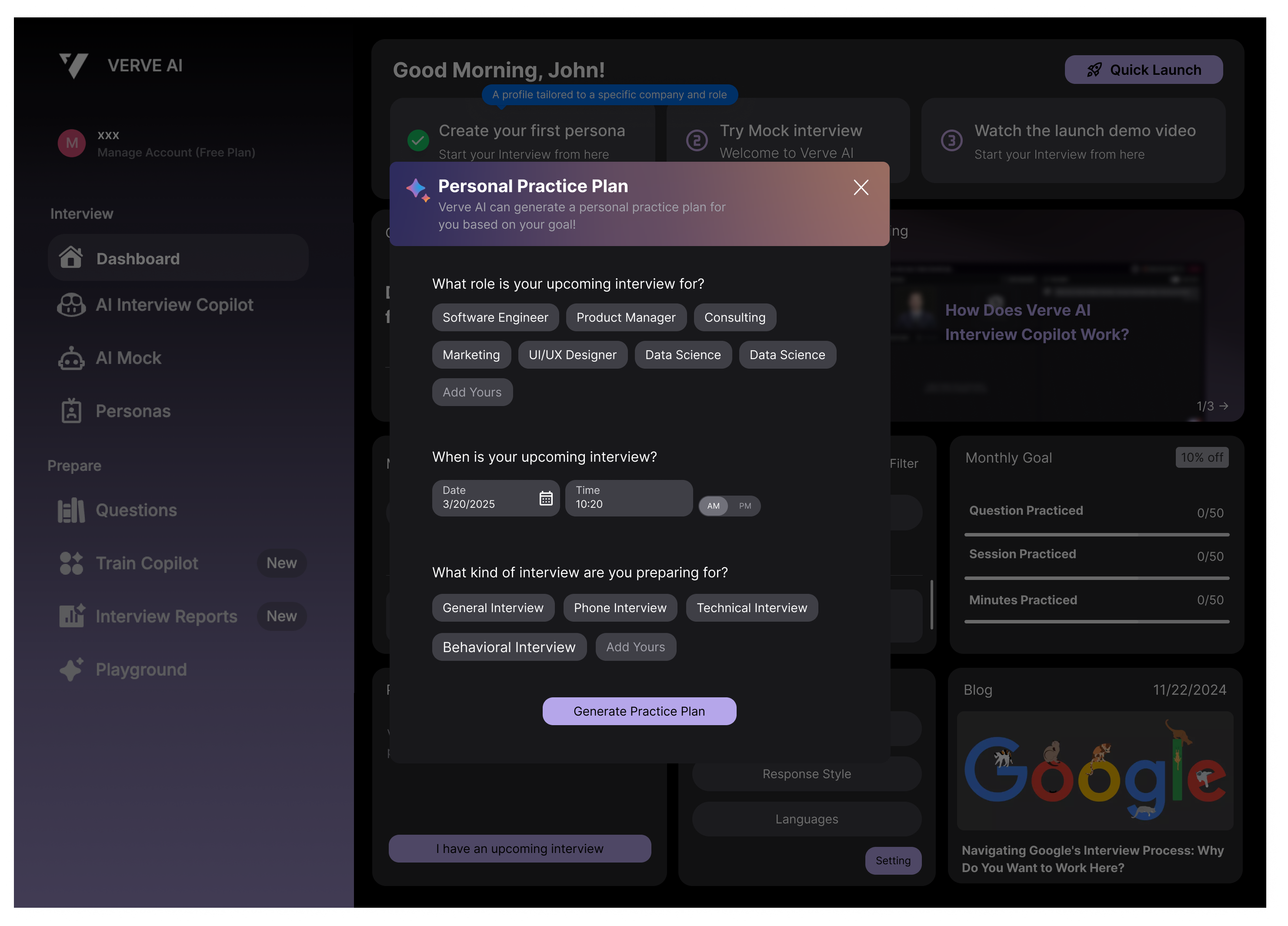
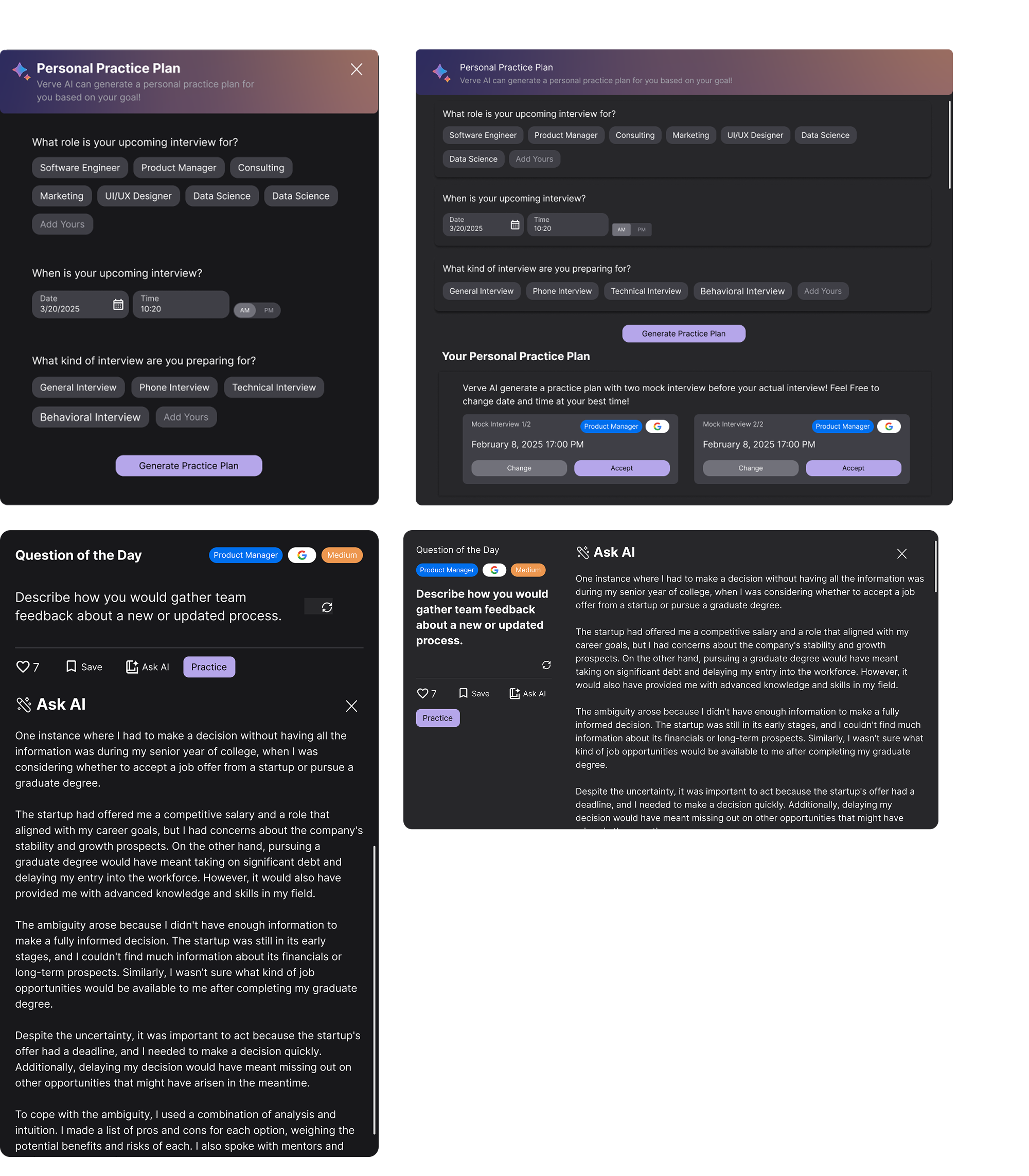
- Personal Practice Plan
- Question of the day
2. Motivate user to boost engagement
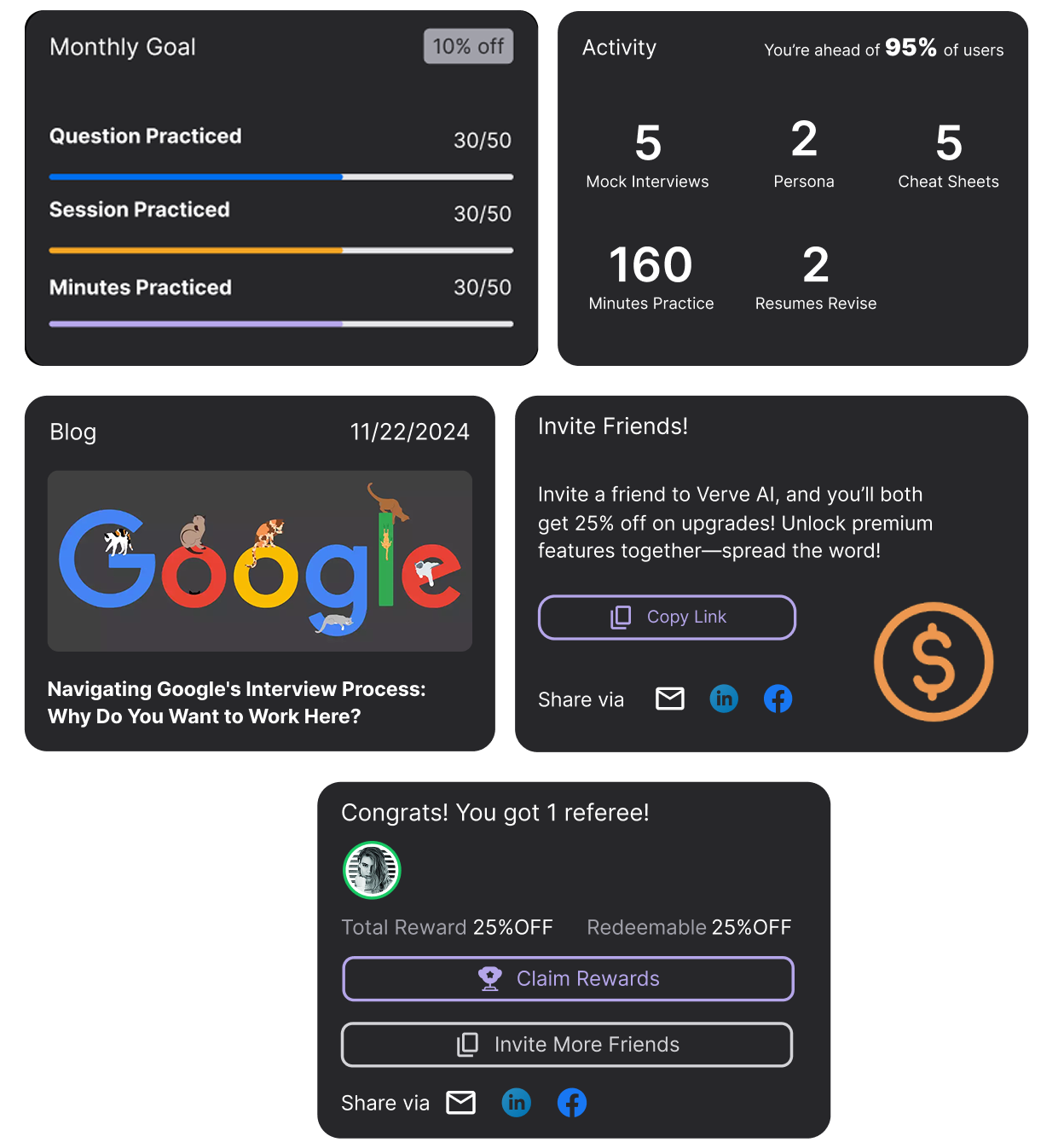
Help users stay engaged through goals, progress, learning, and social rewards.
Visualize progress across questions, sessions, and minutes practiced
Highlight user achievements and rankings to visualize progress and enhance motivation.
Provide users with interview knowledge and skills to increase engagement and retention.
Users can invite friends to earn rewards, helping grow the platform and improve retention.
Help users stay engaged through goals, progress, learning, and social rewards.
- Monthly Goal Tracker
Visualize progress across questions, sessions, and minutes practiced
- Activity
Highlight user achievements and rankings to visualize progress and enhance motivation.
- Blog
Provide users with interview knowledge and skills to increase engagement and retention.
- Refer
Users can invite friends to earn rewards, helping grow the platform and improve retention.

3. Make hidden features easily accessible
I bring the hidden features to surface, making it easier for users to discover and access key functionalities effortlessly.
I bring the hidden features to surface, making it easier for users to discover and access key functionalities effortlessly.
- Learnings
- Meeting Report
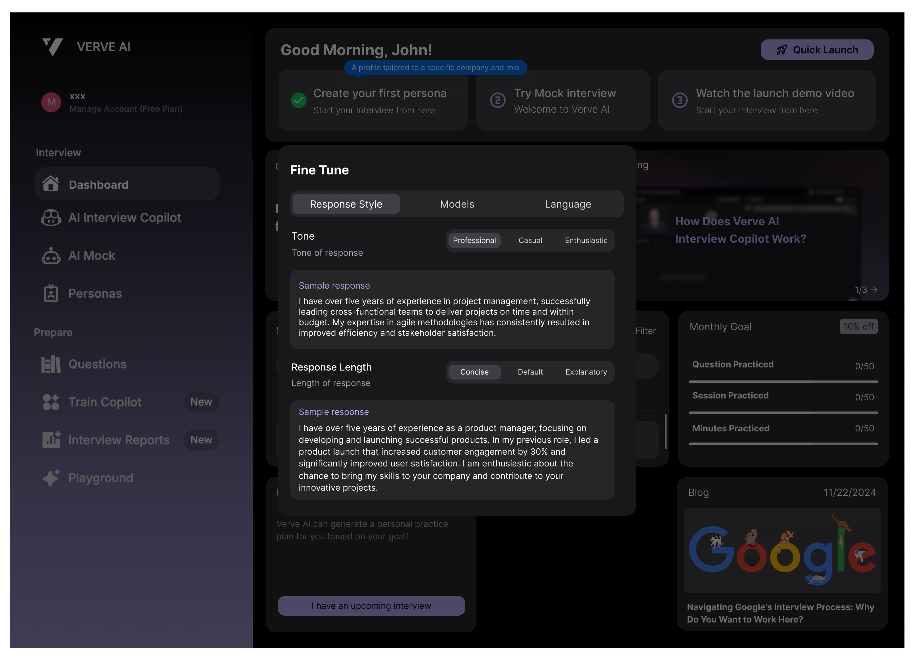
- Fine Tune
Final Design

Other highlight
The developer has their own front-end components, which don’t always align with the design requirements. This often requires me to adjust and align UI decisions with the existing development components. For example, the Personal Practice Plan and Question of the day wasn't compatible with the developer's component, so I worked closely with them to refine the UI and ensure it fit the layout.
Result
The redesigned experience has been developed to create a more supportive and engaging first-time journey. Early internal feedback from the CEO and cross-functional stakeholders validated the approach, with the improved flow, clearer guidance, and trust-building touchpoints seen as meaningful improvements over the previous experience.
By guiding users to the product’s core value earlier, the redesign establishes a stronger foundation for activation, engagement, and retention. It was built to reduce early drop-off and better support long-term business goals, including stronger adoption, higher customer lifetime value, and more efficient acquisition over time.
By guiding users to the product’s core value earlier, the redesign establishes a stronger foundation for activation, engagement, and retention. It was built to reduce early drop-off and better support long-term business goals, including stronger adoption, higher customer lifetime value, and more efficient acquisition over time.
Reflection
1. Collaborating Closely with the CEO Gave Me a Bigger Picture
Working directly with the CEO gave me valuable exposure to high-level thinking — not just about design, but about the product and business as a whole. It helped me understand how to connect user experience decisions with company goals, and taught me how to communicate design value in a way that resonates with leadership. I also learned to be proactive in driving progress and keeping alignment across different teams.
Working directly with the CEO gave me valuable exposure to high-level thinking — not just about design, but about the product and business as a whole. It helped me understand how to connect user experience decisions with company goals, and taught me how to communicate design value in a way that resonates with leadership. I also learned to be proactive in driving progress and keeping alignment across different teams.
2. Designing with Constraints Builds Focus
With limited tech resources and some backend constraints, I had to be smart about what to prioritize. This experience taught me how to work within what's feasible, and still deliver real value. I learned to simplify without sacrificing usability — sometimes the best solutions come from working with what you have, not what you wish you had.
With limited tech resources and some backend constraints, I had to be smart about what to prioritize. This experience taught me how to work within what's feasible, and still deliver real value. I learned to simplify without sacrificing usability — sometimes the best solutions come from working with what you have, not what you wish you had.